
During the trial on 25 and 26 November 1878, where the offending painting was displayed, as well as his Nocturne: Blue and Gold; Old Battersea Bridge, he carefully avoided referring to his paintings as “pictures,” calling them “arrangements,” “symphonies,” “nocturnes,” etc., and he stated: “Art should be independent of all clap-trap – should stand alone, and appeal to the artistic sense of eye or ear [my emphasis], without confounding this with emotions entirely foreign to it, as devotion, pity, love, patriotism, and the like.” This statement was quoted in the press and has become universally famous. Concerning ‘nocturne,’ he said: “By using the word ‘nocturne’ I wished to indicate an artistic interest alone, divesting the picture of any outside anecdotal material which might have been otherwise attached to it. A nocturne is an arrangement of line, form, and colour first. The picture is throughout a problem that I attempt to solve. I make use of any means, any incident or object in nature, that will bring about this symmetrical result.” This may be, but it is not the original meaning of the word which was applied beginning early in the 19th century – the first composer to use it, in 1813, was John Field (1782-1837), but it was Chopin (1810-1849) who made the form famous, his first ones written in 1830-31 – to pieces of music, mostly for the piano, that were dreamy and suggested dusk or evening; prior to Whistler, it had not been used in visual art.After the trial, Whistler issued three publications dealing with his tussles with art critics:
1) the 17-page pamphlet Whistler v. Ruskin: Art and Art Critics in December 1878, just in time for Christmas;
2) The Ten O’Clock, a lecture he delivered at that hour on 20 February 1885 at Princes Hall in London, repeated on 24 March in Cambridge and in Oxford on 30 April, and subsequently printed in 1888, in which he set forth his ideas about art, his place in the history of art and in his own society, his inspiration, the relationship of his works to nature (“Nature contains the elements, in colour and form, of all pictures, as the keyboard contains the notes of all music. / But the artist is born to pick, and choose, and group with science, these elements, that the result may be beautiful–as the musician gathers his notes, and forms his chords, until he bring forth from chaos glorious harmony.”), and current movements in art and aesthetics. It was translated into French in 1888 by the poet Stéphane Mallarmé (1842-1898), whom he met in Paris that year and with whom he became close friends; Whistler regularly attended Mallarmé’s Tuesday evening salon gatherings after he moved to Paris in 1892; and
3) The Gentle Art of Making Enemies (1890, rev. & expanded 1892) in which he recounted the trial in the first 19 of its 340 pages, reprinted the W. v. R. pamphlet (pp. 21-39), reprinted The Ten O’Clock (pp. 135-159; above quote on pp. 142-43) and reactions to it, including excerpts from one by Oscar Wilde, with whom he became close friends beginning in August 1881, and also set forth his ideas and principles in notes, comments, and reflections, and included letters to the editor and to and from others, telegrams, the catalogues of two exhibitions: one of 51 of his Venice etchings and drypoints (pp. 93-105), and one entitled “Nocturnes, Marines, and Chevalet Pieces” (44 items, including several of those listed two paragraphs above, pp. 293-328) with critics’ comments (many of them negative. (The 1892 edition was reprinted by Dover in 1967 and can still be found at very reasonable prices. See also: Linda Merrill, A Pot of Paint: aesthetics on trial in Whistler v. Ruskin, Washington: Smithsonian Institution Press, 1992.)
In spite of the profusion of musical terms in his titles, the prominence of harmonious blends in his choice of colors and his painting style, and his numerous references to the similarities between painting and music, Whistler seems not to have devised any systematic relationship between the colors and actual musical sounds, notes, or keys. Rather he seems to have found an intuitive parallel between music and painting, and used those terms to evoke an ambiance, atmosphere, emotion, mood, or sentiment that the musical form in its title might also evoke or inspire and exploit it to (pre-)dispose the viewer favorably to his works as well as to epitomize his aesthetic vision. He focused first and foremost on tonal harmony or harmonies among and between tones or shades of colors; he owes something of a debt in this to the Romantic artist J.M.W. Turner, but took Turner’s work with light in land- and seascapes (his 1845 Sunrise with Sea Monsters is a late example) ‘to the next level’ into the realm of color per se. Turner’s 1835 Music Party, East Cowes Castle, Petworth is already well on the way using much brighter colors; note the similarities in treatment, albeit in a totally different style, to Kandinsky’s 1911 Impression III, Konzert, of people gathered around a music-maker, with black and white being important central colors.
In The Gentle Art…, Whistler wrote: “My whole scheme was only to bring about a certain harmony of colour.” (p. 8) [The most accessible and thorough reference book for him is Richard Dorment & Margaret F. MacDonald, Whistler, London: Tate Gallery Publications, 1994, catalogue for an exhibition that was held at the Tate, the Musée d’Orsay in Paris, and the National Gallery of Art in Washington, DC, where I saw it; all of the aforementioned paintings are reproduced in it, and many more, with the Symphony in White No. 2 on the hardcover edition’s jacket and cover of the paperback edition. Unreferenced quotes in the first two paragraphs about Whistler above appear on pp. 137 and 122 respectively.] Whistler was the model for the character Elstir in Marcel Proust’s (1871-1922) À la recherche du temps perdu; he is also named in the work and paintings marked with an * above are mentioned or alluded to in it.
On the other hand, there were a number of artists and theorists who had either very detailed or less fully developed systems of specific color-sound correspondences. Several artists in the early decades of the twentieth century, leading up to and just after WW I, developed concepts and theories about the interrelationships of colors, their relationship to each other and their harmonies or dissonances, and associated them with the notes of the musical scale. Both concepts were also associated with emotional reactions to the two art forms and their products. As Charles Riley writes, “Color is identified with the emotional, rhapsodic, emancipated, formless, and even deceitful aspect of art.”(p.6) It is always contrasted with line, design, structure; color is Dionysian, line Apollonian. Initially, the concepts were developed in connection with abstract art, “the creation of a painting generated by the physical properties of color alone,” in the words of William C. Agee, in Synchromism and Color Principles in American Painting, 1910-1930, the catalogue of a 1965 exhibition in NYC (New York: M. Knoedler & Co., 1965, p. 9), but eventually they were also applied to figural and representational paintings including landscapes, portraits, and still lifes. Morgan Russell (1896-1953) insisted that “color as a generator of form, movement, and rhythm, orchestrated and moving in time demands an abstract painting, composed like music, of an intangible, non-literal matter.” (Ibid., p. 20)
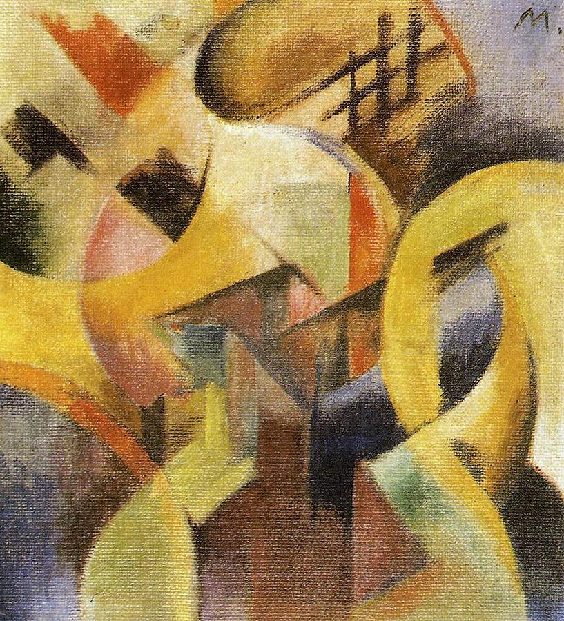
Major French painters such as Paul Cézanne (1839-1906) and Henri Matisse (1869-1954) and German ones such as the Expressionists and members of Der Blaue Reiter and Die Brücke groups, used these principles without systematizing them, for example, Franz Marc (1880-1916; he was killed in WW I) in works like his 1913 Small composition I, who also painted a pair entitled Playing Forms and Fighting Forms (both 1914) and applied them to paintings of animals, one of his favorite subject matters, as in his 1914 Vögel (Birds), or his 1913 Träumendes Pferd (Dreaming Horse) that he had earlier painted realistically in entirely unrealistic colors – think of his famous 1911 Die grossen blaue Pferde (The Large Blue Horses).
Some American painters became acquainted with the works of those artists while living in Paris in the pre-WW I years, where Robert Delauney (1885-1941) and his wife Sonia Delauney-Terk (1885-1979), whom they knew personally and with whom interacted and occasionally exhibited, were also experimenting with such concepts, making their own color wheels. These painters “adapted nineteenth-century theory to a twentieth-century concept of color, which was viewed as a means to a pure, non-associative painting.” (Ibid. p. 32).
Robert later wrote:
Toward 1912-1913, I had the idea of a kind of painting which, technically, would rely only on color, on contrasts of color, but these developing in time and making themselves perceived simultaneously, at one go. I used Chevreul’s scientific term: simultaneous contrasts. I played with colors as one might express oneself in music through a fugue of colored phrases treated contrapuntally….It is impossible to deny the evidence of these colored phrases animating the surface of the canvas with various kinds of cadenced measures which succeed one another, outstrip one another in movements of colored masses – color acting, this time, almost independently, through contrasts.
(quoted in Dora Vallier, L’art abstrait, Paris: Librairie Générale Française, 1967; Abstract Art, trans. by Jonathan Griffin, New York: Orion Press, 1970, pp. 198-99; original source not cited, but the quote comes from Robert Delauney, Du Cubisme à l’art abstrait; Documents inédits [Unpublished notebooks and other papers] publiés par Pierre Francastel […], Paris: S.E.V.P.E.N., 1957, p. 81, which is note [No. 25] in a notebook from 1939-40, when Delauney is recollecting his artistic development).
His Windows series (13 paintings) are the best example of his work in this style, that combines abstraction and representation in transparent objects in a setting of geometric shapes of contrasting but harmonious colors, and at the same time recalls without imitating Claude Monet’s (1840-1926) various series such as the Poplars, Haystacks, and Rouen Cathedral in its repetition of some subject matter with differences in colors and interpretation. Monet appears, incidentally, to have been the first painter to use colors in shadows “in the sense of trying to write a formulaic approach to them. In this sense, he was like a scientist in approaching the derivative aspects of color relationships.” (Cytowic, p. 255) Thus the Delauneys got not only their concept but also their term of “simultaneous,” as in Sonia’s famous “Simultaneous Dress” that she wore to a ball, from Chevreul. Olivier Messiaen repeatedly stated that Robert Delauney was his favorite painter precisely for this reason.
The American painter Stanton Macdonald-Wright (1890-1973) was in Paris from June 1909 to February 1915, worked with Russell, and exhibited abstract works created using these principles, that he titled synchromy/-ies (= with color), with him both in Berlin and Paris in 1913. In their jointly composed introduction to the former exhibit, they wrote:
Mankind has until now always tried to satisfy its need for the highest spiritual exaltation in music. Only tones have been able to grip us and transport us to the highest realms. Whenever man had a desire for heavenly intoxication, he turned to music. Yet color is just as capable as music of providing us with the highest ectasies [sic.] and delights.
By having liberated ourselves from certain impediments and ties and plunged boldly into the unknown, we have wrested from nature the secrets necessary for bringing painting to this highest degree of intensity. Moreover, painting has the advantage over music of being closer to reality, for the visual sense connects us with nature to a higher degree than does the sense of sound. There is nothing higher to be striven for in art once this is finally achieved. (Gail Levin, Synchromism and American Color Abstraction, 1910-1925, New York: George Braziller & the Whitney Museum of American Art, 1978, p. 129; catalogue for an exhibition organized by the Whitney, that also traveled to 5 other cities., trans. from orig. German by Martha Humphreys.)
They also exhibited in “The Forum Exhibition of Modern American Painters,” held at the Anderson Galleries in NYC in March 1916, that constituted the first introduction of this style of painting to the US, and was the most important modern art exhibition in the US after the (in)famous Armory Show in February-March 1913 that introduced to American art lovers modern European artists who overshadowed the American ones whose work constituted ¾ of those in the show [There will be some centennial exhibits this year.]. The Forum was the name of the sponsoring magazine; its art critic, Willard Huntington Wright, brother of Stanton Macdonald-Wright, often referred to as “America’s first aesthetician,” formed a six-member organizing committee, including himself, painter Robert Henri (See below.) who did not exhibit, and photographer Alfred Stieglitz. Each member wrote a 2- to 3-page forward for the catalogue (New York: Mitchell Kennerley, 1916, pp. 25-41) that followed an introductory essay by Wright entitled: “What Is Modern Painting?” (pp. 13-24).
Seventeen artists (of 21 invited) exhibited; each wrote an “Explanatory Note” for the works shown, printed on the left page facing the reproduction on the right page of one painting of her/his choice, presented in alphabetical order in the catalogue. Macdonald-Wright’s begins: “I strive to divest my art of all anecdote and illustration, and to purify it to the point where the emotions of the spectator will be wholly æsthetic, as when listening to good music.”, and closes: “By the above one can see that I strive to make my art bear the same relation to painting that polyphony bears to music. Illustrative music is a thing of the past: it has become abstract and purely æsthetic, dependent for its effect upon rhythm and form. Painting, certainly, need not lag behind music.” ([p. 56]; pages of the notes & reproductions section are unnumbered, facing Organization, 5 [1st link below]; he exhibited 12 paintings).
Morgan Russell wrote, in his note ([p. 67]; he exhibited 8 paintings) facing Cosmic Synchromy (1913-14; 3rd link below):
My first synchromies represented a personal manner of visualizing by color rhythms; hence my treatment of light by multiple rainbow-like color-waves which, expanding into larger undulations, form the general composition.
In my next step I was concerned with the elimination of the natural object and with the retention of color rhythms. An example of this period is the Cosmic Synchromy. The principal idea in this canvas is a spiralic plunge into space, excited and quickened by appropriate color contrasts.
His concluding paragraph reads:
While there will probably always be illustrative pictures, it cannot be denied that this century may see the flowering of a new art of forms and colors alone. Personally, I believe that non-illustrative painting is the purest manner of æsthetic expression, and that, provided the basic demands of great composition are adhered to, the emotional effect will be even more intense than if there was present the obstacle of representation. Color is form; and in my attainment of abstract form I use those colors which optically correspond to the spatial extension of the forms desired.
(See also Anne Harrell, The Forum Exhibition: Selections and Additions, New York: Whitney Museum of American Art, 1983, pp. 3-7; “Introduction” to the catalogue for a retrospective exhibition. Other famous participating artists include Thomas Hart Benton (See below.], Arthur G. Dove, Marsden Hartley, John Marin, and Man Ray; several other exhibitors mention the connection between painting and music and the importance of color rhythms in their notes.)
Here are links to some representative paintings:
Stanton Macdonald-Wright:
Abstraction on Spectrum (Organization No. 5) (1914): http://emuseum.desmoinesartcenter.org/ & use the Advanced Search feature with the artist’s name.
Synchromy in Purple minor (1918): http://blantonmuseum.tumblr.com/post/25577387649/stanton-macdonald-wright-synchromy-in-purple
Yin Synchormy No. 3 (1930): http://www.carolinaarts.com/301ncmusuem.html
Morgan Russell:
Cosmic Synchromy (1913-14): http://en.wikipedia.org/wiki/File:Cosmic_Synchrony.jpg [Synchromie cosmique; this is on the cover of the Levin book.]
Synchromy in Deep Blue-Violet (1913) [Synchromie en bleu-violacé]: http://www.askart.com/askart/r/morgan_russell/morgan_russell.aspx
***
Both artists knew the Delauneys, although they parted ways; much later (1939-40) Robert Delauney claimed to have invented synchromism, but this was likely the result of memory issues related to his age and not a deliberate attempt to claim credit unjustifiably. Macdonald-Wright admitted that Russell coined the term and originated some of the concepts, but it was he who set them forth in a rational, organized text in his 1924 a treatise on COLOR, privately published in only 60 copies with individually hand-painted accompanying color plates because it was intended for his students in the Art Students League in Los Angeles. It was reprinted in facsimile in The Art of Stanton Macdonald-Wright, an exhibition catalogue for a 1967 retrospective at the Smithsonian Institution (Washington, DC, Smithsonian Press, 1967, pp. 65-100.), but without its plates and templates, a real disservice because the original is very difficult to find; some plates are reproduced in another exhibition catalogue: Will South [ et al. (incl. Agee)], Color, Myth, and Music: Stanton Macdonald Wright and Synchromism, NC Museum of Art, 2001, pp. 32-33.). [It was this 2001 exhibition, which I viewed numerous times independently, and showed several times to friends and to groups as a volunteer docent at the NCMA, that piqued my interest in this subject and set me off on the path of inquiry, investigation, reading, and research that led to my writing this piece.]
In the treatise, Macdonald-Wright set up an exact relationship between the 12 colors of the color wheel formed from primary, secondary (created with equal mixtures of the primaries), and tertiary colors (created with equal mixtures of the primary and secondary ones), with the intervals of the 12 notes/semitones (including sharps and flats) in a Western chromatic scale on a keyboard, and created “color scales,” beginning with the key of C = yellow, followed by yellow-green, green, blue-green, blue, blue-violet, violet, red-violet, red, red-orange, orange, yellow-orange, and back to yellow (reproduced in South, p. 32). For the key of red, you find the equivalent musical key by starting at the position of red in the sequence of the notes of this scale (G#/Ab); likewise for the key of blue mentioned earlier (E), or green (D), for example. For his paintings, he chose the colors that matched the notes of the triads, 1st, 3rd, and 5th notes of musical chords, rather than the theretofore customary selection based on their geometrically opposite positions in the standard color wheel, and created “color chords.” The plates and templates illustrated the process. He suggests chords that would be most suitable for specific genres of paintings. “Thus the scale, when utilized with intelligence[,] takes the place of the sun in nature, and binds all things or colors (because in painting we enter a world where color is everything), into a close-knit unity. In music and painting the utilization of the scale is merely man’s way of stating his belief in the possible existence of complete perfection.” (treatise, p. 31 [97 in facsimile]).
Note that in Scriabin’s color circle of fifths (shown in Cytowic & Eagleman, p. 191), the key of C is red, A is green, and the key of blue is F minor (F#/Gb) as mentioned earlier (Ibid, p. 190). This wheel and the correspondences are also found in the writings of Helena Blavatsky (treatise1831-1891), founder of the Theosophical Society, with which Scriabin was familiar. Theosophy has a long history of which you can explore a summary here. None of the Synchromist painters seem to have been adherents of this, and perhaps were not even aware of it.
In fact, Macdonald-Wright and Russell (and some others) derived these ideas from the lessons of Canadian Ernest Percyval Tudor-Hart (1873-1954), who was teaching in Paris at the time, where both joined his class. Tudor-Hart based “his musical system of color harmony on a purely psychological rather than a physical group of equivalents.” (Levin, p. 1) “He claimed that pitch in sound related directly to luminosity in color, that tone in sound equaled hue in color, and that intensity of sound corresponded to saturation of color [See above about the biological/physical perception of color.]. He explained: ‘The twelve chromatic intervals of the musical octave … have corresponding sensational and emotional qualities to those of the twelve chromatic colors.’.” (Ibid., quoting Klein, p. 103). He set forth his concepts in a pair of articles in The Cambridge [UK] Magazine: “A New View of Colour,” Feb. 23, 1918, pp. 452-56, and “The Analogy of Sound and Colour,” Mar. 2, 1918, pp. 480-86. In the latter, he posits a spectral range (including all possible blends of the 7 basic colors) equivalent to 11 octaves, with only 7 visible to the human eye, the bottom 2 appearing black and the top 2 appearing white. This is essentially the equivalent of the standard piano keyboard; it equals 84 keys, 88 = 7.33, 90 = 7.5 octaves. He calculates the blends and progressions mathematically and proportionally.
Some other American artists working in the same period, including Thomas Hart Benton (1889-1975)*, who lived in Paris from 1908 to 1911 and was close to Macdonald-Wright then, and later studied with him in 1915 when both were back in NYC, also followed these principles. Benton used the term ‘synchromist’ in the title of at least one of his works, but most of his works in this style have been lost or destroyed. Other artists who were well-known then but are nearly entirely forgotten now, followed Macdonald-Wright’s and Russell’s lead, although did not consider themselves Synchromists or follow the principles precisely. Notable among them are Patrick Henry Bruce (1881-1956) and Arthur Burdett Frost, Jr. (1887-1917), both of whom also lived in Paris in the early 20th century and knew Russell and Macdonald-Wright and the Delauneys, to whom they became very close and whose Orphism style they ultimately followed; both also took a class from Matisse, one of the originators of that style [The link is excellent, chock full of information, and with several illustrations and internal links, nearly all of which are pertinent to this piece.].
Their Synchromist works often combine abstraction and representation while focusing on the harmonious relationships of the colors; in particular, Frost painted a Harlequin (reproduced in Agee, Pl. VII) that would make a splendid diptych to Picasso’s famous one. Alexander P. Couard (1891-1965), Konrad Cramer (1888-1963), Andrew Michael Dasburg (1887-1979)*, Asheville, NC, native James Henry Daugherty (1889-1974), Arthur B. Davies (1862-1928), Morton Schamberg (1882-1918), and Jay Van Everen (1875-1947) are yet others. [Artists whose names are marked with an * also exhibited in The Forum Exhibition; Dasburg’s catalogue statement, facing his Improvisation, focuses on rhythm, “on coordinating color and contour” ([p. 50]; he exhibited 9 paintings); he also writes: “I differentiate the æsthetic reality from the illustrative reality.”] All of them painted their works in this style before Macdonald-Wright wrote his treatise, and all of them painted works in other styles as well.
Other well-known artists who also followed this path, but with less emphasis on the harmonies among the colors and their connection to music, include Josef Albers (1888-1976), who taught for a time at Black Mountain (NC) College, and Joseph Stella (1887-1946); they tended to use color more geometrically and separately in the manner of the Cubists, who often worked in black, white, and grey, tones that do not relate well to musical sounds, and highlighted contrasts more than harmonies. Many Synchromist paintings are more curvilinear, even sinuous in their geometry than Cubist ones or those of Albers and Stella. For Macdonald-Wright in particular, the paintings “are cubist fragmentations metamorphosed into elusive segments of shimmering light and color.” (Agee, p. 32.) “Cubism […] provided a structural basis from which the entire range of the spectrum was diffused in an all-encompassing and enveloping iridescence.” (Ibid.) The Synchromists produced “sophisticated rendering[s] of figures in space through the use of color properties.” (Levin, p. 43). These works are not unrelated, as Agee points out (p. 32), to “the atmospheric effects” of the works of J.M.W. Turner that Macdonald-Wright admired, and to the works of Whistler although their tones are often brighter and less hazy.
***
(For Part IV of this article, click here.)


